Furniture color often shapes the visual impression of a room, even when the basic structure remains unchanged. A cabinet, storage unit, table, or wall panel can take on a different character simply through a change in surface color. For that reason, color selection has become an important part of furniture surface planning rather than a final decorative step.
A light surface can make furniture appear visually softer, while a darker finish may give greater definition to edges and shapes. Neutral shades can create a quiet appearance that works with different interior elements, whereas warmer tones can make a room feel more relaxed. Color does not work alone, since texture, surface sheen, furniture shape, and surrounding materials all influence how a finished piece is perceived.
PVC Film For Furniture provides a range of surface color directions for different design needs. Solid shades can create a clean appearance, while textured finishes can bring more visual detail to a plain panel. Choosing between them requires attention to the furniture itself as well as the space where it will be used.
What Solid Colors Are Commonly Used for Furniture Surfaces
Solid colors remain a practical choice for furniture because they create a consistent surface without adding a visible pattern. White, black, grey, beige, and similar neutral shades can be used across cabinets, shelves, doors, and other furniture surfaces.
White finishes tend to create a bright and simple appearance. They can work well where furniture needs to blend with a light interior. Grey offers more variation, ranging from soft shades that feel calm to darker tones that give furniture stronger visual definition. Black can create a clear contrast, especially when used alongside lighter walls or surrounding surfaces.
Beige and other soft neutral colors sit between cool and warm visual styles. Such shades can work with wood‑colored floors, light walls, or furniture containing mixed materials.
Color depth matters as much as color selection. A pale grey and a deep grey may belong to the same color family while creating very different impressions. When a large furniture surface is covered with one shade, subtle changes in tone become easier to notice, so the surrounding environment should be considered before a final choice is made.
How Do Wood Inspired Colors Change Furniture Appearance
Wood‑inspired colors bring a different visual quality to furniture because color is combined with a visible grain pattern. Instead of presenting a uniform surface, the finish can suggest the appearance of natural wood while keeping the furniture design consistent.
Light wood shades often create a relaxed and open feeling. Medium brown tones can give cabinets and panels a warmer appearance, while deeper wood colors can add visual weight to larger furniture pieces. The result depends not only on the base color but also on the direction, spacing, and contrast of the grain pattern.
Wood Grain PVC Film is often considered when a plain furniture panel needs more surface character. A similar cabinet design can look noticeably different when covered with a pale oak‑like shade compared with a darker walnut‑like tone. Grain direction can influence the visual proportions as well. A vertical pattern may emphasize height, while a horizontal pattern can make a panel appear wider.
Using a wood‑inspired finish does not mean every part of a furniture set needs to carry the same tone. Some designs use a wood surface on larger panels and a plain neutral shade on smaller sections, creating a quieter contrast without introducing many colors.
What Warm Colors Can Be Used in Furniture Finishes
Warm colors generally include soft beige, cream, tan, warm grey, and various brown shades. Furniture finished in such tones can create a more comfortable visual connection with wooden flooring, fabric furnishings, and other warm interior elements.
Brown has several possible directions. A pale brown can feel light and understated, while a deeper brown gives a heavier appearance. Beige is useful when a furniture surface needs warmth without creating a strong visual statement. Cream can provide a softer alternative to plain white, especially in rooms where a completely cool appearance may feel out of place.
Warm colors can be used with both solid surfaces and wood‑inspired patterns. A plain warm beige may suit a simple cabinet, while a brown grain pattern can add detail to a larger storage unit. Matching should remain balanced, since too many warm shades with similar depth can make a room appear visually crowded.
Furniture size matters as well. A warm color that works nicely on a small cabinet may feel different when applied across a large wall of storage. Looking at the full surface area helps prevent the selected shade from becoming visually heavier than expected.
How Do Cool Colors Work on Furniture Surfaces
Cool colors can create a cleaner and quieter visual direction. Grey with a cool undertone, muted blue, and related shades can suit furniture placed in modern interiors, work areas, bedrooms, or spaces where a restrained appearance is preferred.
Grey is especially flexible because its appearance changes according to surrounding colors and lighting. A pale cool grey may appear almost white under certain lighting conditions, while a darker grey can provide stronger separation from light walls and floors.
Cool colors can work with both solid finishes and subtle patterns. A cool grey solid surface gives furniture a uniform appearance, while a grey wood‑inspired finish introduces grain detail without moving too far from a restrained color palette.
Care is needed when combining several cool surfaces. A room with cool walls, cool flooring, and cool furniture may feel visually distant. Adding a warmer wood tone through selected furniture panels or nearby materials can create a more balanced appearance.
How Do Wood Grain PVC Film Colors Differ From Solid Colors
Solid colors rely mainly on tone to shape the appearance of a furniture surface. Wood grain finishes add another visual layer through lines, variations, and changes in pattern direction. As a result, two surfaces with similar base colors can create noticeably different impressions.
| Finish Direction |
Visual Character |
Suitable Consideration |
| Light Solid |
Clean and soft |
Light‑colored rooms and simple furniture |
| Dark Solid |
Defined and contrasting |
Furniture needing stronger visual separation |
| Light Wood Grain |
Natural and relaxed |
Cabinets, shelves, and living spaces |
| Medium Wood Grain |
Warm and balanced |
General furniture surfaces |
| Dark Wood Grain |
Deeper and heavier |
Larger furniture pieces and selected accent areas |
| Neutral Wood Grain |
Restrained with surface detail |
Spaces using a simple color palette |
Pattern density should be considered alongside color. A strong grain pattern can draw more attention than a subtle one, even when both use a similar brown tone. For large panels, a restrained pattern may keep the surface easier to visually process. Smaller furniture components can accommodate more visible grain without affecting the overall balance as strongly.
Color choice therefore involves more than selecting a shade from a palette. Surface pattern, furniture size, room lighting, and nearby materials all influence how a finished panel will look once it becomes part of a complete interior.
Which Colors Work Well With Different Furniture Styles
Furniture style can guide color selection because surface appearance needs to fit the shape and purpose of each piece. A simple cabinet with flat doors can carry a wider range of shades, while furniture with many lines or decorative details may look more balanced with a quieter surface.
For simple interior spaces, white, soft grey, beige, and muted wood shades can maintain a calm visual relationship. Furniture with a traditional appearance may work naturally with brown and warm wood colors, especially when grain patterns follow the shape of doors or panels.
Modern furniture often uses neutral colors such as grey, black, white, and understated wood tones. A combination of a solid color with a wood‑inspired surface can create separation between different sections without introducing too many visual elements.
Room function matters as well. Bedroom furniture may suit softer shades that create a relaxed appearance, while storage units in working areas can use grey, white, or deeper colors according to the surrounding materials. Furniture used in living spaces has more freedom in color selection because it often needs to connect with flooring, walls, curtains, and other large surfaces.
How Does Lighting Affect Furniture Film Colors
A furniture surface rarely looks identical under every lighting condition. Natural daylight, warm indoor lighting, and cooler artificial lighting can change how a color is perceived, even though the actual surface remains unchanged.
A pale beige may appear warmer under soft indoor lighting, while a cool grey can appear more neutral in daylight. Dark colors can absorb visual attention in a dim room, whereas light surfaces may appear more open when enough natural light reaches them.
Surface finish can influence the same perception. A smoother surface with a noticeable sheen may reflect surrounding light, while a less reflective finish can create a quieter appearance. Wood grain patterns can behave in a similar way because changes in light can make some parts of the pattern more visible than others.
For furniture used near windows, checking the color under daylight is useful. Pieces placed in areas with limited natural light need a different approach, since a shade selected from a bright showroom or screen may appear deeper once installed.
Looking at a sample beside the actual wall, floor, and nearby furniture can provide a more realistic impression than viewing the color by itself.
What Should Be Considered When Matching Furniture Film Colors
Color matching becomes easier when furniture is considered as part of a larger interior rather than as an isolated object. Walls, floors, doors, work surfaces, curtains, and decorative elements can all influence whether a chosen finish feels connected or separate from its surroundings.
Several practical points can be considered during selection:
- Check the main color already used in the room.
- Compare furniture color with the floor rather than looking at each surface separately.
- Consider whether cabinet doors and side panels need the same finish.
- Look at how much of the selected color will be visible after installation.
- Compare solid colors with wood grain options before making a final decision.
A large storage unit may cover a considerable visual area, so a small difference in tone can become more noticeable once many panels are placed together. Smaller furniture pieces offer greater flexibility because the selected finish occupies less of the surrounding space.
Using one color across every furniture component is not always necessary. A neutral cabinet body paired with wood‑colored doors can create a clear visual division, while a wood surface combined with a soft solid shade can reduce the amount of visible pattern.
How Can Color Choice Affect the Visual Size of Furniture
Color can change how furniture appears in relation to the surrounding room. Light surfaces generally create a lighter visual impression, while deeper shades can make large pieces feel more visually defined.
A tall cabinet with a light finish may blend more easily with a light wall, making its overall shape less prominent. A dark cabinet against a pale background creates stronger separation, allowing edges and panel divisions to stand out.
Grain direction can add another visual effect. Vertical wood patterns can draw the eye upward, which may suit tall storage furniture. Horizontal patterns can emphasize width and work naturally on broader panels. A balanced grain direction can help the surface follow the basic geometry of the furniture.
Color depth should be considered together with furniture size. A deep brown finish may work well on a small cabinet door while creating a heavier visual effect across a large storage wall. Similarly, a very pale finish can lose some of its surface definition when placed in a space filled with light‑colored materials.
Rather than treating color as an isolated decorative choice, it is useful to consider how much surface will be visible and what surrounds it.
What Should Be Checked Before Choosing PVC Film For Furniture
Choosing a suitable finish requires more than comparing several colors. Furniture structure, room conditions, lighting, nearby materials, and personal design preferences all influence how a surface will appear after installation.
Start with the basic furniture design and decide whether a plain surface or a visible grain pattern fits the intended appearance. Solid colors can create a uniform visual field, while Wood Grain PVC Film can add lines and texture‑like variation to broad panels.
Next, consider the room itself. A light‑colored space may accept both neutral and deeper furniture finishes, while a darker room may benefit from surfaces that reflect more light visually. Floor color deserves particular attention because furniture usually sits directly against it, making the relationship easy to notice.
Sample checking can help reduce unexpected differences. A color seen on a screen or small catalog image may appear different when placed beside actual furniture materials. Viewing samples under both natural and indoor lighting can reveal changes that are difficult to notice under one lighting condition.
Furniture use should remain part of the decision as well. A surface used on frequently handled cabinet doors may be viewed from close range, while a large wall panel may be seen from farther away. Pattern strength, color depth, and surrounding finishes can therefore be judged according to the position and scale of each component.
A practical selection process can follow a simple order:
- Identify the furniture style and structure.
- Check the colors already present in the room.
- Decide between a solid surface and a wood‑inspired pattern.
- Compare light and dark shades under actual lighting.
- Consider how the selected finish will look across the full furniture surface.
- Check whether different furniture components need matching or contrasting finishes.
PVC Film For Furniture can take on many visual directions through changes in color, pattern, and surface appearance. Solid white or grey can create a quiet setting, warmer beige and brown can bring a softer character, while wood‑inspired finishes introduce additional visual detail without changing the basic furniture structure.
A suitable color choice comes from looking at the complete setting rather than focusing on one shade alone. Furniture size, room lighting, surrounding materials, grain direction, and surface coverage all contribute to the final appearance, giving color selection a practical role in furniture design as well as decoration.



 English
 русский
 Español
 عربى
عربى

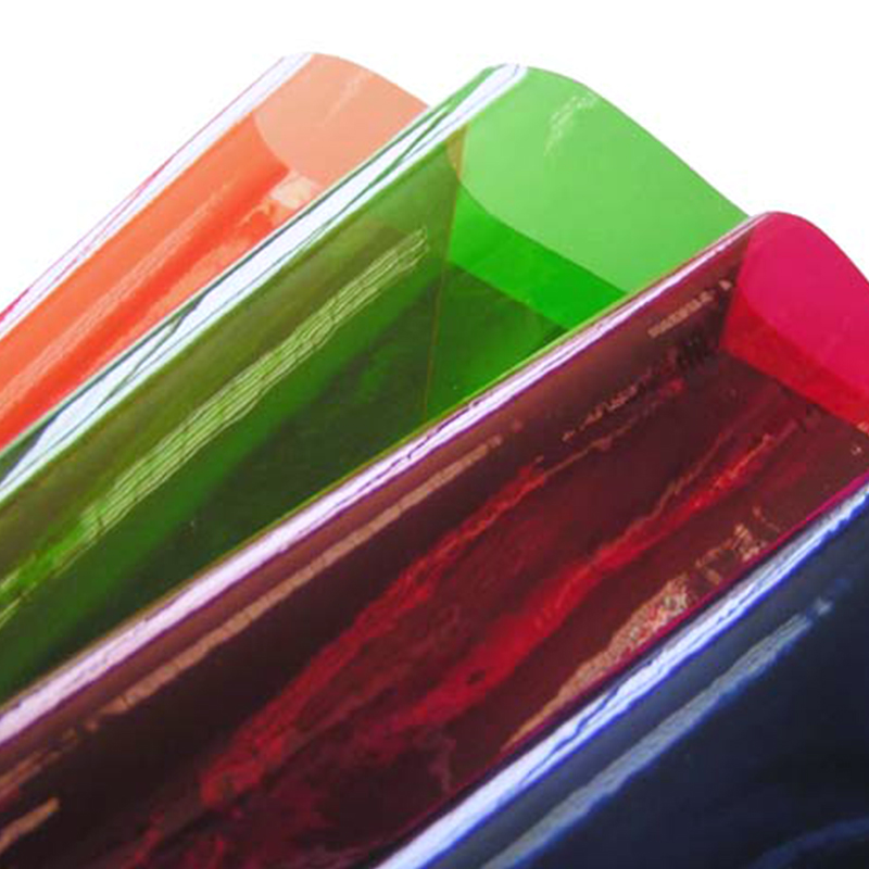
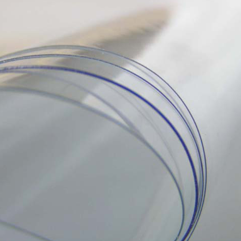 OverviewOur Super Clear PVC Film for tablecloths offers ultra-transparent protection while maintaining a sleek appe...
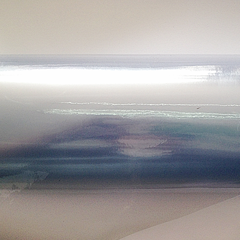 OverviewReliable clear PVC film featuring a powdered, non-sticky surface and slightly lower clarity. Normal Clear P...
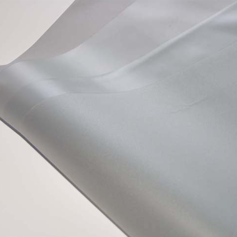 OverviewSemi-transparent PVC film with matte finish, delivering light diffusion and a refined tactile feel. Flexibl...
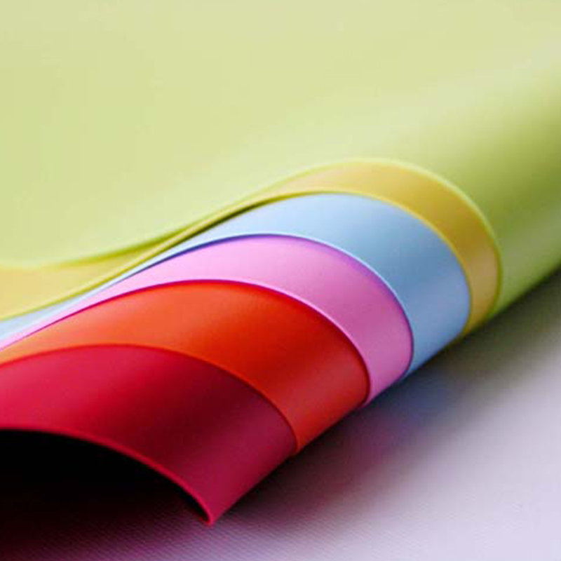 OverviewDecorative yet functional embossed PVC film combining color and surface texture for protective book covers....